BIOCOOP
Let Organic be both compelling and engaging
The challenge
A pionneer in the organic sector for 30 years, and France’s leading organic retailer, Biocoop needed to clarify its difference in a context of increasing competition.
Our solution
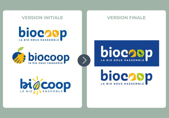
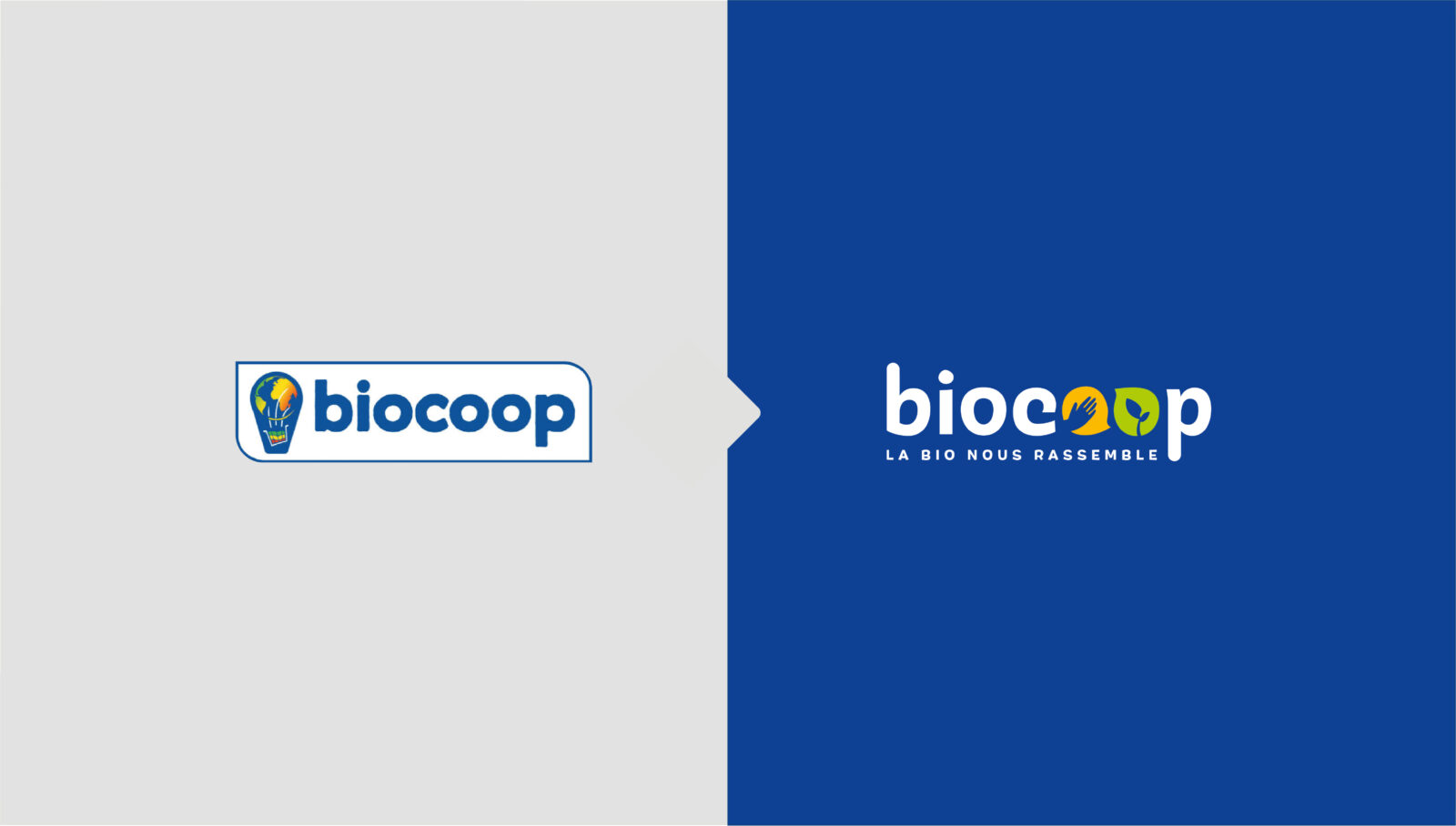
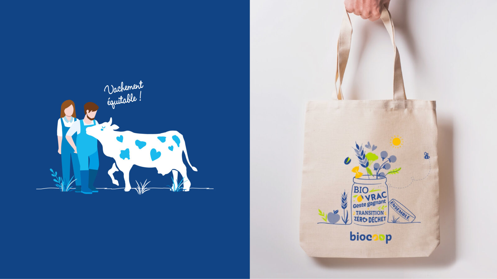
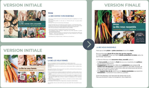
We crafted a warmer and more inviting identity, to capture the redefined brand platform “Bio unites us”.
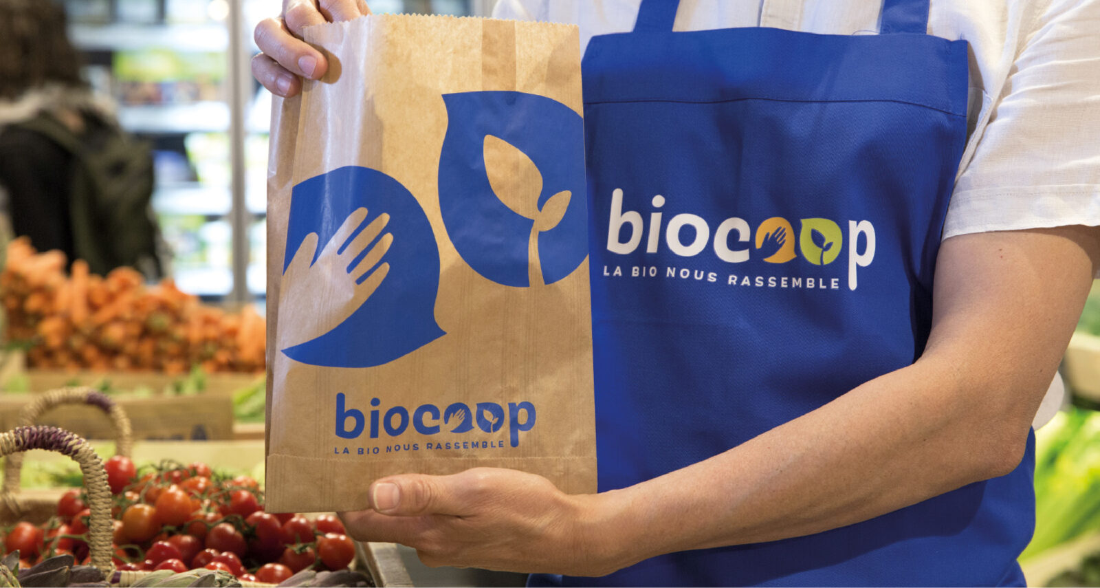
Embracing blue as our brand color, conveying positivity and reassurance. The outstretched hand and the young shoot symbolize collaboration among all stakeholders towards a desirable future.
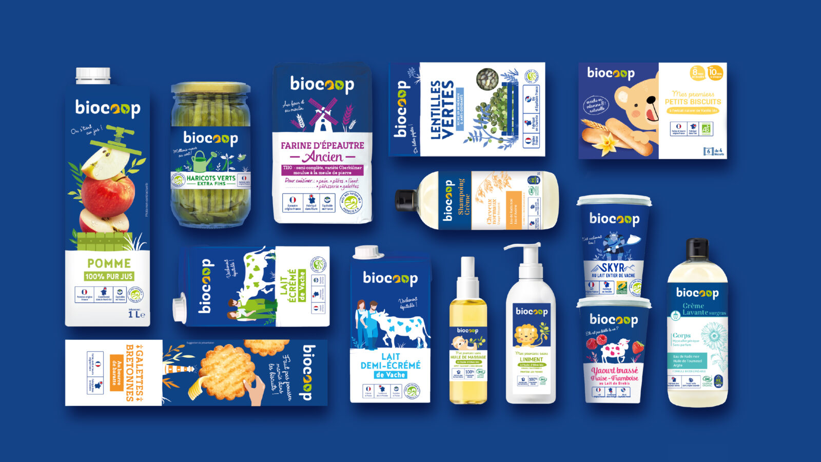
This shift was further pursued through a revamped private label strategy, grounded in a reaffirmed set of standards and a redefined visual identity spanning over 500 products.
Tangible outcomes include a 5% increase in in-store traffic and the successful recruitment drive for owned brand products since 2020.
Blackbox Input
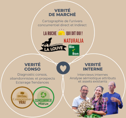
The choice of a collaborative process with Biocoop’s team members and stakeholders through the sequenced use of brand audit, brand platform, brand lab, and design lab tools.
BRAND PLATFORM
Our process for auditing and identifying scenarios to (re)define brand platforms.
BRAND LAB
Our iterative brand positioning qualitative research process.
DESIGN LAB
Our iterative brand and packaging design qualitative research process.
