MATERNE
Reconquering families
The challenge
To regain the lead in a very competitive category, Materne needed to enhance its perceived value and reaffirm its brand image as simple, natural, and a ‘safe choice,’ attentive to the needs of its target audience: families with children.
Our solution
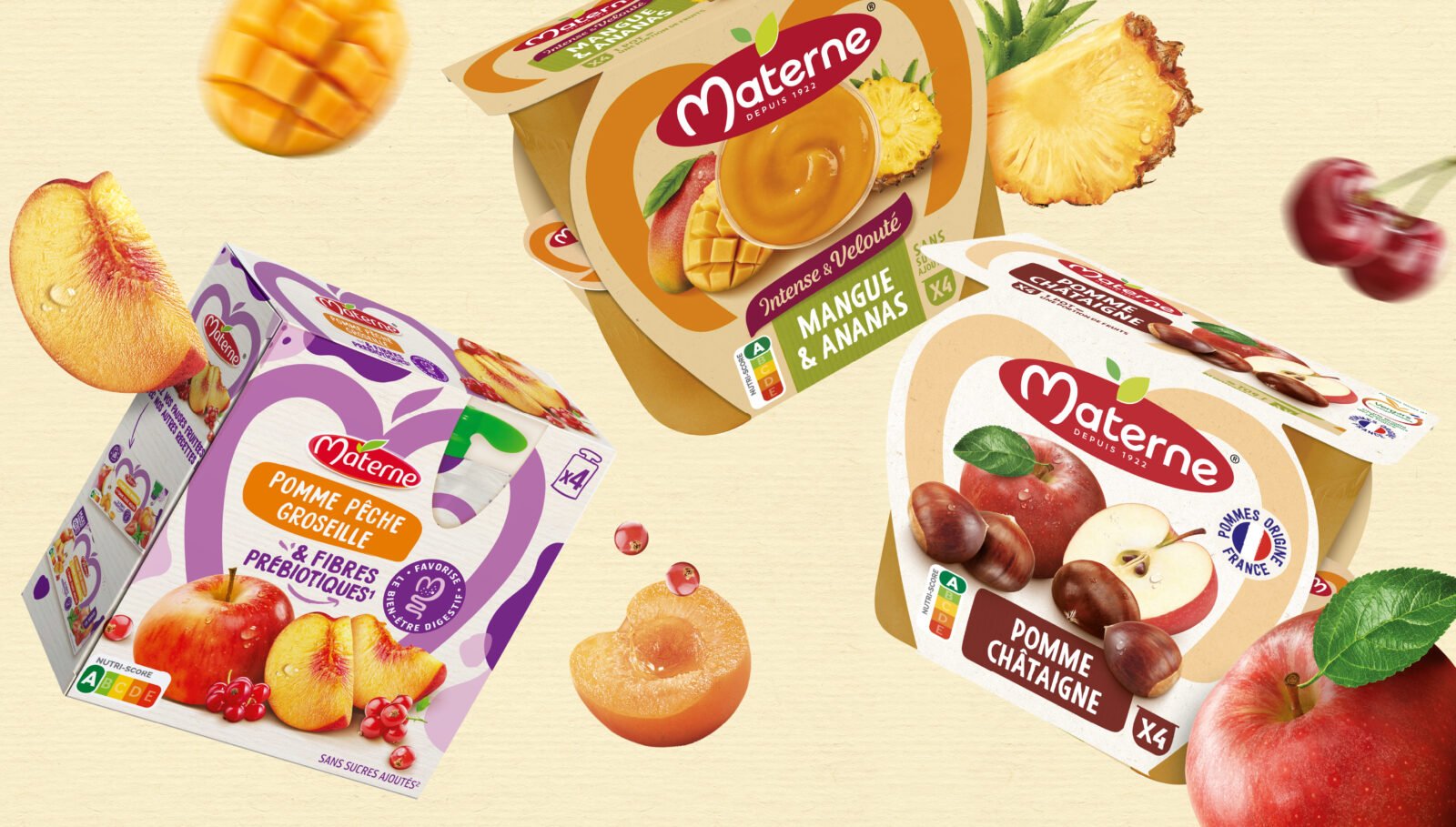
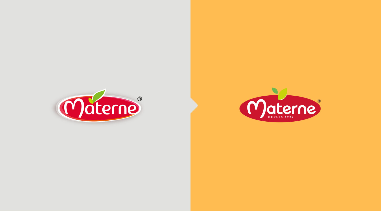
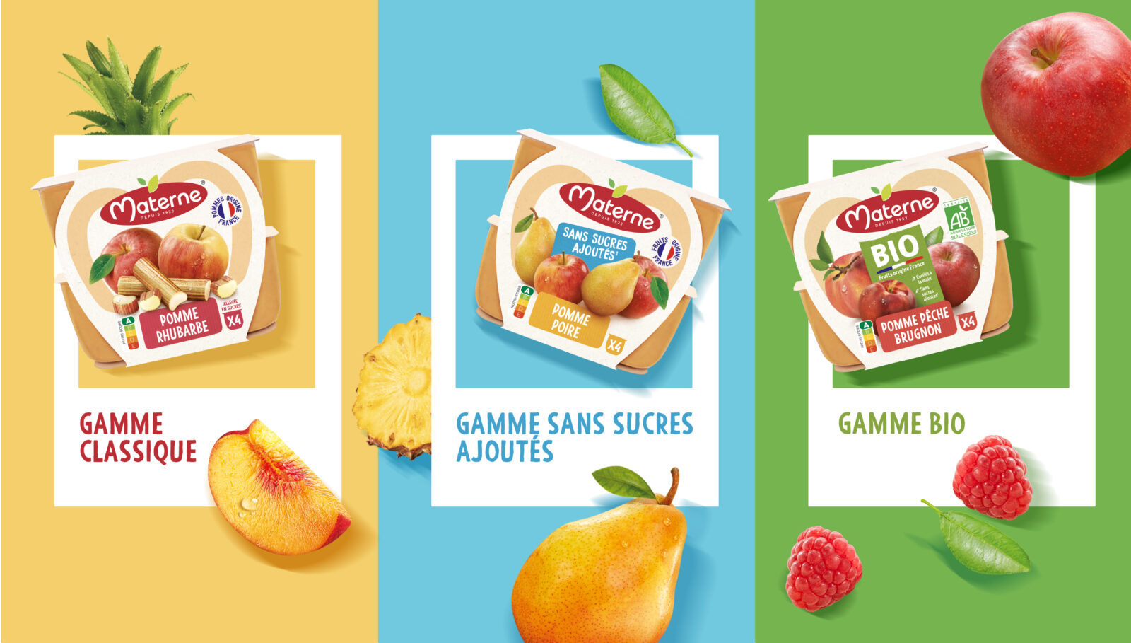
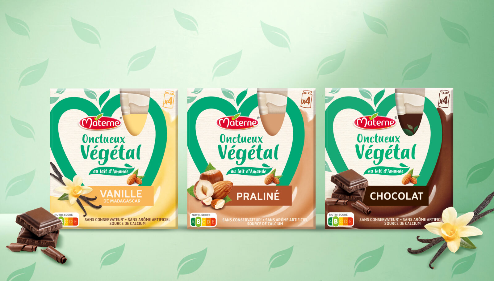
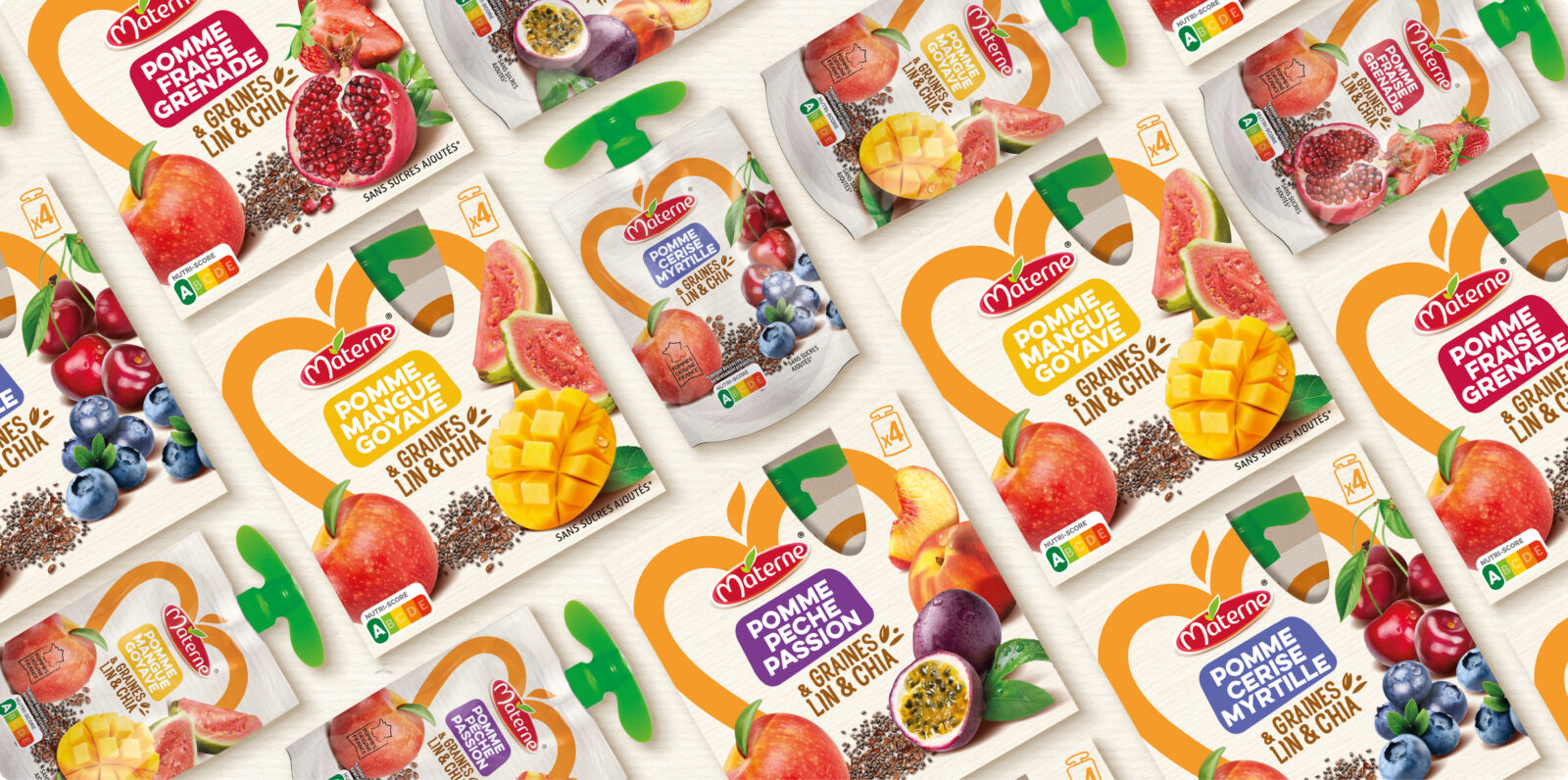
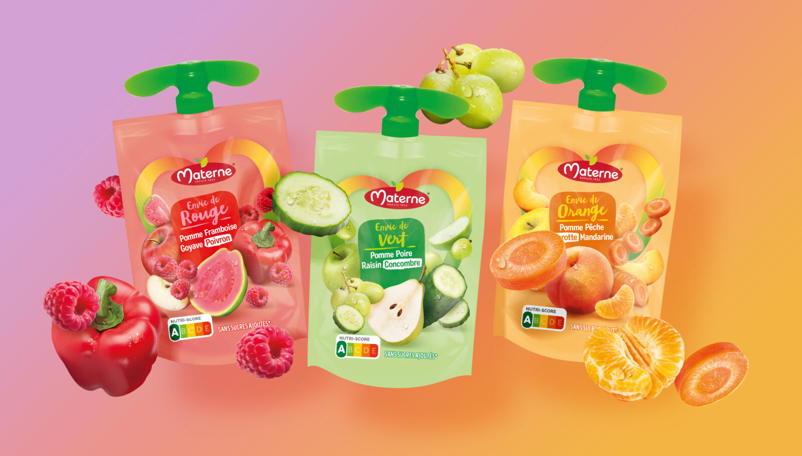
To support the new Materne platform around well-being, we undertook a complete brand and packaging redesign, with a revamped range architecture aimed at facilitating navigation and strengthening shelf impact.
The result: a streamlined, modernized brand, conveying indulgence and naturalness, and a simplified packaging structure that puts fruit back at the heart of the proposition.
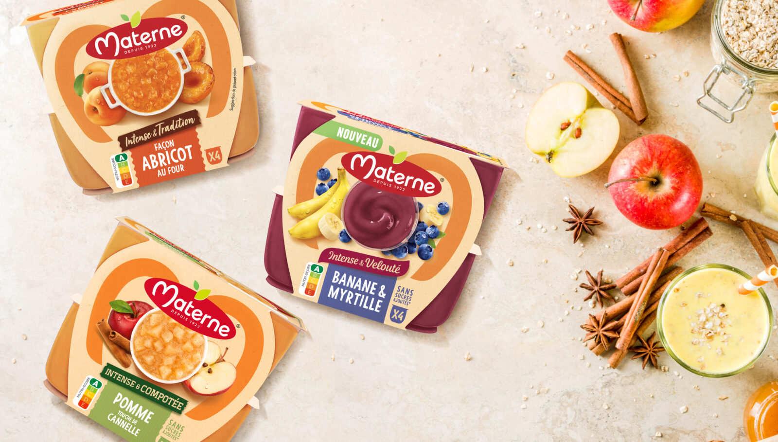
An new identity rolled out across the fruit cups core business, then expanded to encompass all snacking segments.
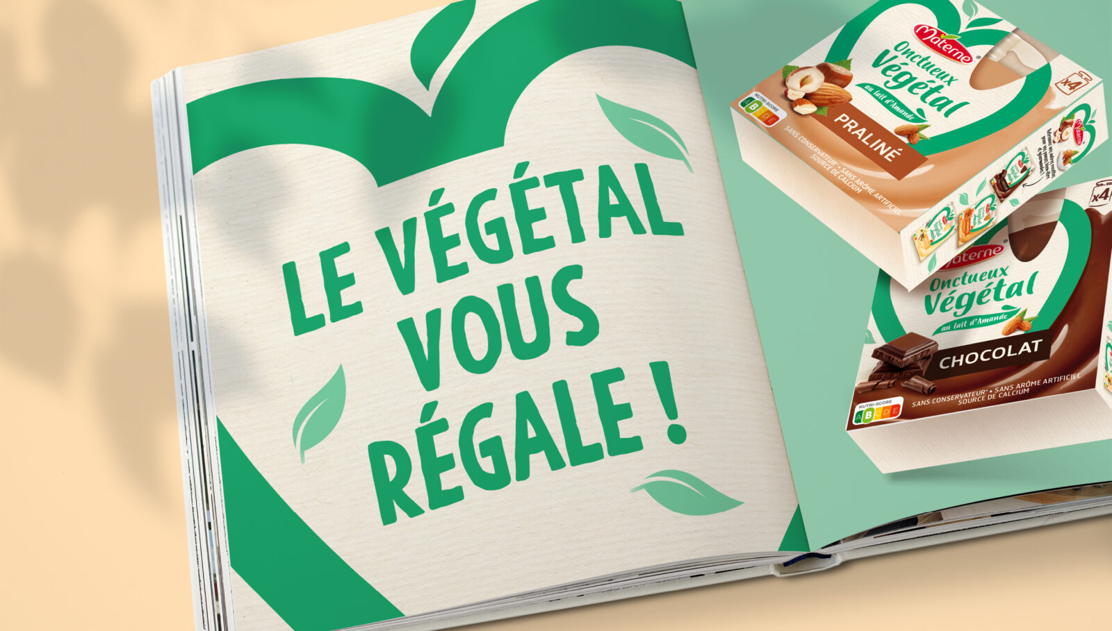
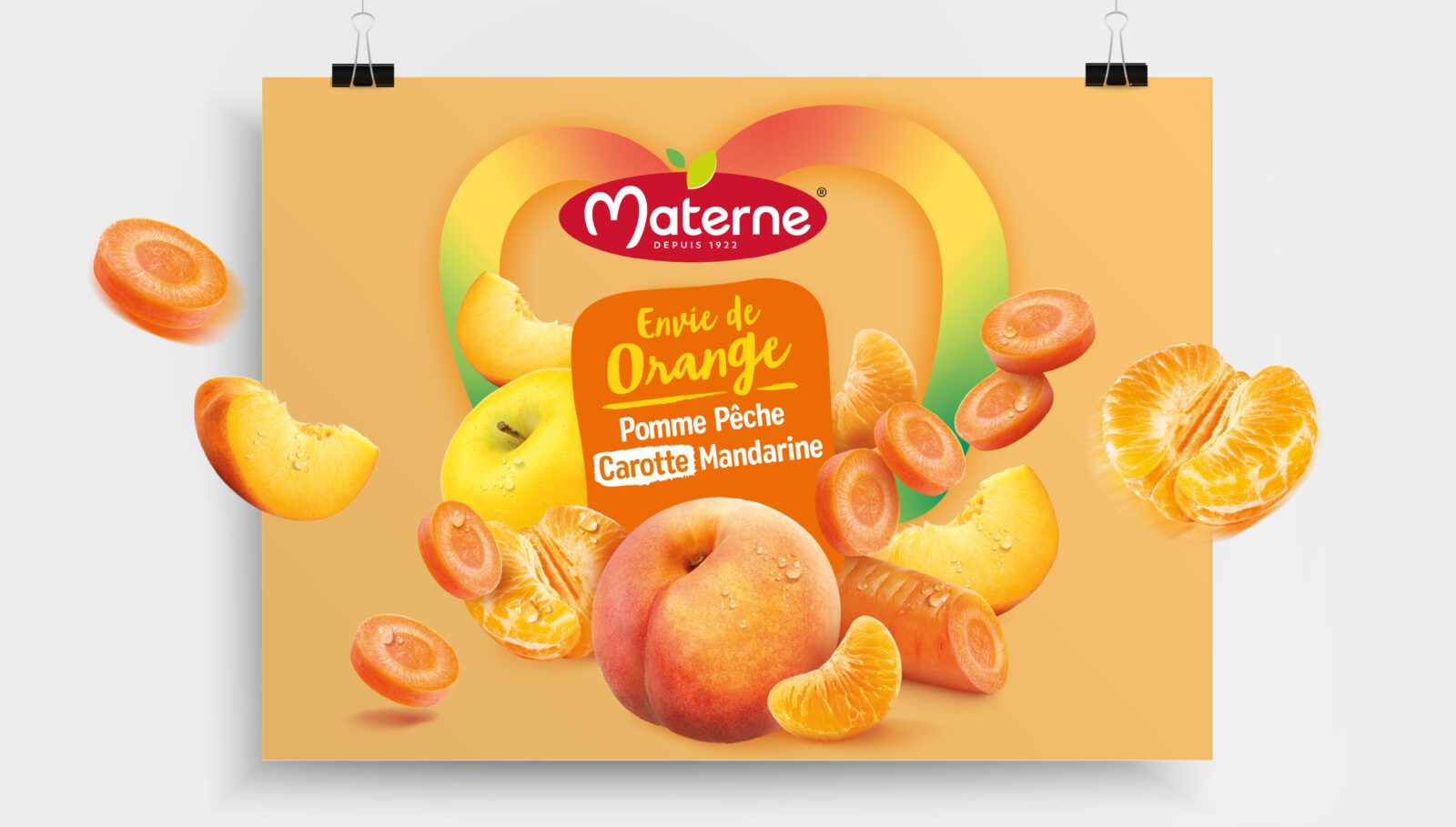
Our work also included the creation of new ranges, to attract new audiences seeking novel offerings: original fruits, plant-based, seeds, fruit & vegetable mixes.
